The TidyTuesday project for March 27, 2019 consisted of Pet Registrations from Seattle. I had the good fortune to work with this data set prior on a Chromebook Data Science data visualization project.
Load Libraries
Attaching package: 'dplyr'
The following objects are masked from 'package:stats':

    filter, lag
The following objects are masked from 'package:base':

    intersect, setdiff, setequal, union
Attaching package: 'zoo'
The following objects are masked from 'package:base':

    as.Date, as.Date.numeric
Rows: 52519 Columns: 7
── Column specification ────────────────────────────────────────────────────────
Delimiter: ","
chr (7): license_issue_date, license_number, animals_name, species, primary_...

ℹ Use `spec()` to retrieve the full column specification for this data.
ℹ Specify the column types or set `show_col_types = FALSE` to quiet this message.
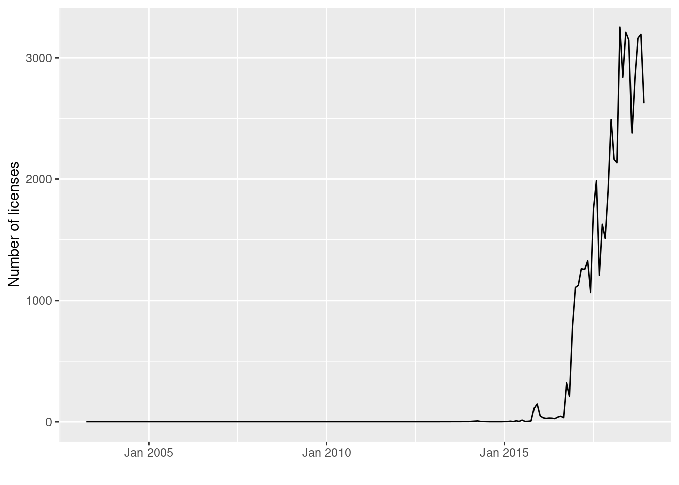
This line chart proivdes the framework for a polished graph below. The code chunk below uses a one two punch with with lubridate and zoo to work with the dates.
## add date and ym columnsseattle_pets$date <- lubridate::mdy(seattle_pets$license_issue_date)seattle_pets$ym <- zoo::as.yearmon(seattle_pets$date, "%y%m")## how the number of licenses recorded has changed over timeseattle_pets %>%## group by yearmonth (`ym`)group_by(ym) %>%## count number within each groupsummarise(n=n()) %>%ggplot(., aes(ym, n)) +## geom name for line chartgeom_line() +scale_x_yearmon() +xlab("") +ylab("Number of licenses")
Explanatory Graph
The data spans many years when there were no registrations or licences; I was able to use the filter function to emphasis that registrations were very limited prior to January 2017. In January 2017 you are able to observe the number of registrations increase from January 2017 and peaking in February 2018.
## add date and ym columnsseattle_pets$date <- lubridate::mdy(seattle_pets$license_issue_date)seattle_pets$ym <- zoo::as.yearmon(seattle_pets$date, "%y%m")## how the number of licenses recorded has changed over timeseattle_pets %>%## group by yearmonth (`ym`)filter(ym >"June 2015") %>%group_by(ym) %>%## count number within each groupcount(species) %>%ggplot(., aes(ym, n, group = species, color = species)) +## geom name for line chartgeom_line() +scale_x_yearmon() +xlab("") +ylab("Number of licenses") +scale_colour_manual(values =c("blue","red3","white", "grey")) +theme_fivethirtyeight() +labs(title ="Change in Licenses Over Time") +labs(caption ="Seattle Open Data Portal")
Explanatory Bar Charts
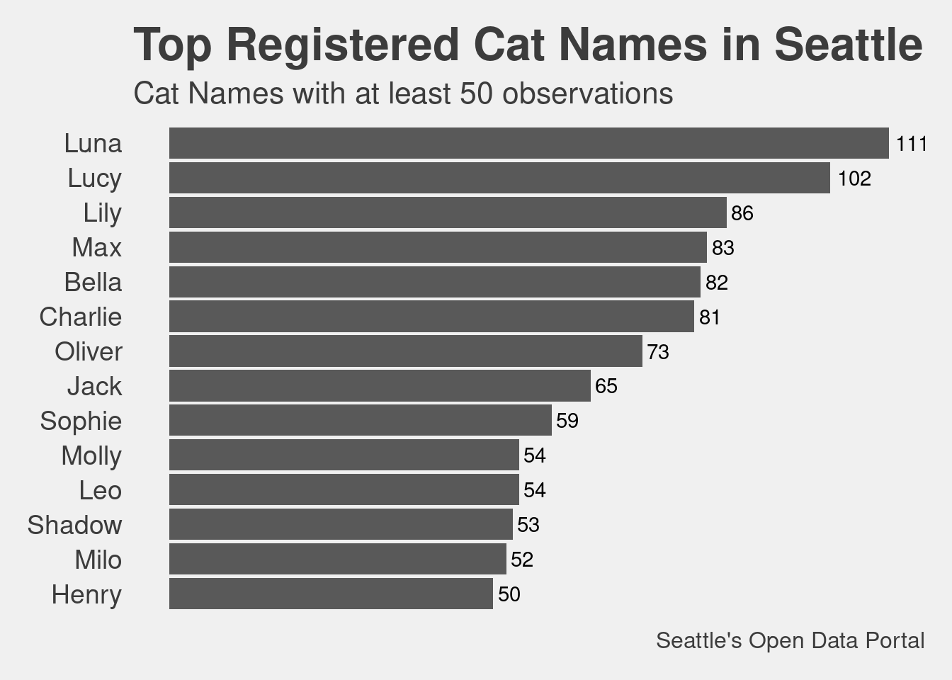
The mutate statement here along with the reorder statement puts the bar graph in order. I saw another example where you can use reorder within the aes statement in ggplot2.
cat_p <- seattle_pets %>%filter(species =="Cat", animals_name !="") %>%group_by(animals_name) %>%summarise(n =n()) %>%filter(n >49) %>%mutate(animals_name =reorder(animals_name, n)) %>%ggplot(aes(x = animals_name, y =n)) +geom_bar(stat="identity") +coord_flip() +theme_fivethirtyeight() +theme (axis.text =element_text(size =14), title =element_text(size =16), legend.position="none", plot.caption=element_text(size =12), panel.grid.major =element_blank(), panel.grid.minor =element_blank(),axis.text.x =element_blank() ) +labs(title ="Top Registered Cat Names in Seattle") +labs(subtitle ="Cat Names with at least 50 observations") +labs(caption ="Seattle's Open Data Portal") +ylab("Name Count") +xlab("Cat Name")+geom_text(aes(label =paste0(as.integer(n)),x = animals_name,y = n, stat="identity", hjust =-0.2, ))
Warning in geom_text(aes(label = paste0(as.integer(n)), x = animals_name, :
Ignoring unknown aesthetics: stat
cat_p
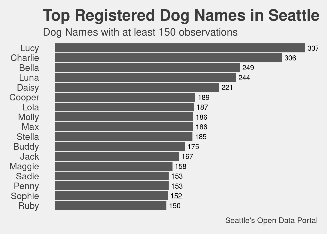
dog_p <- seattle_pets %>%filter(species =="Dog", animals_name !="") %>%group_by(animals_name) %>%summarise(n =n()) %>%filter(n >149) %>%mutate(animals_name =reorder(animals_name, n)) %>%ggplot(aes(x = animals_name, y =n)) +geom_bar(stat="identity") +coord_flip() +theme_fivethirtyeight() +theme (axis.text =element_text(size =14), title =element_text(size =16), legend.position="none", plot.caption=element_text(size =12), panel.grid.major =element_blank(), panel.grid.minor =element_blank(),axis.text.x =element_blank() ) +labs(title ="Top Registered Dog Names in Seattle") +labs(subtitle ="Dog Names with at least 150 observations") +labs(caption ="Seattle's Open Data Portal") +ylab("Name Count") +xlab("Dog Name")+geom_text(aes(label =paste0(as.integer(n)),x = animals_name,y = n, stat="identity", hjust =-0.2, ))
Warning in geom_text(aes(label = paste0(as.integer(n)), x = animals_name, :
Ignoring unknown aesthetics: stat
dog_p
Conclusion
I played with the five_thirtyeight theme and it worked well. I think it would work better with some colors in the bar plot but I am not sure how I would want to color this graph.
About
Kevin is a nonprofit data professional operating out of Lakeland, Florida.
My expertise is helping nonprofits collect, manage and analyze their program data.